Last year, we spoke to John Evans, Principal Designer and Founder at Je+1 (John Evans Design), who shared an insight into good store design. We caught up with John again to learn more about his interiors and design journey, with a particular focus on retail design.
Learning the trade
My parents owned a small local retail ironmonger – there aren’t many left nowadays as soon as the likes of Homebase and B&Q opened up it killed them off. We lived above the shop, as was, and probably still is, often the case with small shopkeepers. I have often said that I don’t ever remember not working, because as a family business my sister and I were expected to pitch in. I didn’t mind, it was enjoyable and fun at the same time. The benefit was I learnt an enormous amount about a lot of things.
I learnt about construction techniques, and materials, I learned how to deal with people and I learned about running a retail business and what it takes. My real passion was Art and Design. So, at the age of 23, with an immense amount of help from my parents, I opened my own shop offering items to buy with a design bias. I wanted to bring to the midlands the designer pieces and styles that I saw for sale in the stores in London. Of course, I was incredibly naive, young and ambitious and what I didn’t realise was that design that starts in the capital cities takes a while to filter down to the suburbs, so that cutting edge design that I thought was great didn’t sell very well until about 12 months later, by which time I had moved on to something else. Again, a learning curve.
The wallcoverings and paint that I sold were also cutting edge, which meant that they were difficult to use. No problem I thought, I will start my own decorating company and employ specialists, which I did and called it; The Decorating Company a catchy name, and to borrow a phrase does what it says on the tin. I felt that the van that I bought should reflect the design aspect so I purchased a beautiful old 2cv van and painted it black with the lettering picked out in white. I am not sure that the decorators that I employed were as enamoured with it as much as I was. It wasn’t very practical. It pitched and rolled around corners and hadn’t a great deal of power.
Passion for design
Having the shop did though bring me some amazing opportunities particularly with the people I met. My passion for design led me to use the shop to showcase furniture, accessories and soft furnishings in roomsets, which I changed regularly to attract customers. My wife and I would travel to London, take photos of the latest styles in curtains and blinds and sit in our house in the evening trying to replicate them.
I had sussed out the we had a very popular pub opposite and the car parking in front of our shops window became extended parking for the pub in the evenings. Which gave me a perfect opportunity to showcase my skills. Customers came in and wanted to buy everything just as presented. Representatives who visited, many of whom are still friends today, liked what they saw, which led to things that I hadn’t imagined when I started out.
I was asked to design exhibition stands and showrooms. I was on my way to being a retail designer. The real bonus happened when a certain Graham Kirkham walked onto a stand I had worked on and asked who had designed it. This started a 45-year journey designing furniture stores. When I met Lord Kirkham, he had three stores and an enormous amount of ambition and knowledge of the product he was selling.
We worked closely together to form DFS into the market leader in furniture retailing that it is today, both of us learning how to present and position the product that we were selling in the best possible way. The goal was to make the sale easier for the salesman. I’m pleased to say that Graham is a close friend to this day.
Presentation is key
It’s simple really, if the customer has already decided to buy something because of the way it is presented and priced, it is much easier to take the order and move on to the next person needing assistance. Nowadays it slightly more complicated as we now have the internet, where products can be presented beautifully, more easily than in a physical store. The downside to this for retailers that have both an online and physical presence is that what may be easy to get right online is not always the case in the actual store. This can create disappointment and a customer can be easily lost to a competitor on the retail park with a better presentation.
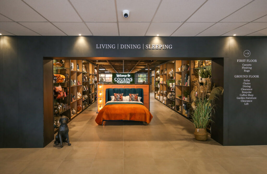
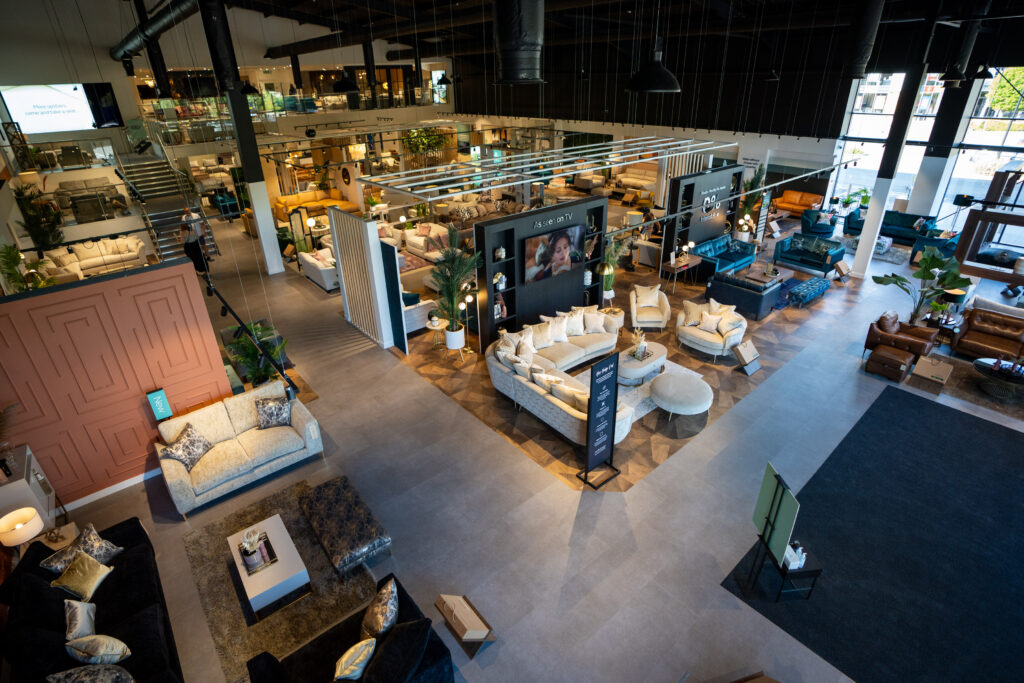
It is imperative that the stores are not allowed to become dated and seen as less important. Online is one thing, but for furniture retailers the stores are important. When making a major purchase such as a piece of furniture most people will want to see it, sit on it, stroke it, see what they are paying for. I know I do. When we are designing a store, every aspect is taken into account starting with the product, this is the most important part of the equation. Who does this appeal to? What is the target audience? How do we present it and make it look more appealing than it already is? There is a lot to consider. A lot of retailers feel it is enough to just to have an item priced and on the shop floor, it isn’t.
The customer journey
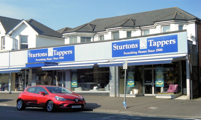
This leads me onto a major consideration of the customer journey. Today, it mostly starts with a Google search, which makes the website really important. This has to be attention grabbing and the products need to be presented well and priced competitively. This should, if done well, lead to the next part of the journey. The visit to the store. On arrival, the outside is very important as this is the first impression and first impressions are so important. If someone else’s store looks more attractive, through either the signage, window display or lighting, your potential customer is going to visit, even if they initially visit your store.
Once you have managed to get them through the doors the important thing for every retailer is to sell them something, this is where the next part of the journey starts. It is important that the displays at the front of the store are attention grabbing but on entering the main focus will be on the store itself, does it meet expectations? Is it bright, well-lit, warm and welcoming? Is the salesperson welcoming without being pushy?
If it’s a large store, can the customer see all there is to offer from the door? If they can you are allowing them to make a judgement without going any further into the body of the store. This is a big mistake as if they had walked the whole store, they may well have spotted something that they would have found irresistible.
Years ago, the way to get customers to walk the store was by providing a walkway that was like a journey around the store. The problem with this approach is that the walkway can lead them around the store and out of the door. What’s needed is a way to guide the customer to the items that you wish to show them and allow them time to take in and appreciate what they are looking at. Over the years, we have developed ways of leading the customer in the direction we want them to go without obvious walkways, which makes for a slower, more enjoyable experience.
There is a reason why Ikea is so successful, it’s not just because the products they sell are irresistible, though they are pretty good. It’s because they force you to look at everything they sell and they present the furniture and accessories in room settings that show you how to use them in the correct way. They make it almost impossible to visit a store and leave without buying something and it is all down to presentation and pricing.
Good lighting
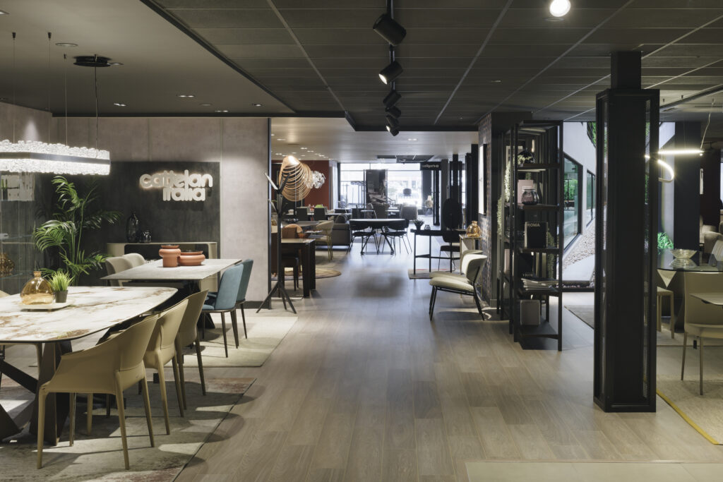
Good lighting is so important to every retailer and yet so neglected by most. The quality of the lighting options offered today is exceptional. There is a right light for every purpose and can be a retailer’s biggest asset. I really don’t understand it, when a store is filled with flat panelled LEDs giving out an average boring light. Yes, it might meet the right amount of lumens calculated for the area size and they may be cost effective compared with the old type fluorescents, but in my view, they are no better. Today’s lighting can enhance the product so much if used correctly. The colour rendering properties are amazing, this means that the products colours can be brought to life and shine out, making it irresistible. It doesn’t matter what the product is that you trying to sell, furniture, fruit and veg, accessories, clothes etc, they can all be enhanced and complimented by using the right lighting.
Final thought…
We want to help you with your retail store and we know we can help you to increase your turnover by planning and presentation. How do we know? Because we have been doing it for over 40 years. Why not give us a call, it won’t cost you a thing to talk to us, and it may be the start of a journey to increased profits.


